
Redesigning the Indigenous Services Canada (ISC) website with an improved navigation system and user-friendly content/layout.
Project background: In a UX/UI Design Bootcamp, we had a design challenge project to redesign a responsive government agency website.
Project type: Individual project (only the research phase was performed with another student)
Timeline: 4 weeks
My role: UX researcher, UX/UI designer
Tool used: Miro, Figma, Invision, Maze
The problem: Users of Indigenous Services Canada (ISC) feel overwhelmed by the amount of information each page shows. As well, they are unable to find the information they need due to the lack of an independent navigation bar on the website and buried links in the text.
The constraints: Maintaining a trustworthy appearance and fast loading speed, especially for remote communities with limited bandwidth.
The solution:
Redesign the website with an improved navigation system including a dedicated navigation bar focusing on ISC content, recognizable icons, and a grid of distinct navigation links instead of solely inline text links, all while keeping images to a minimum.
Who are our users? What is the problem?
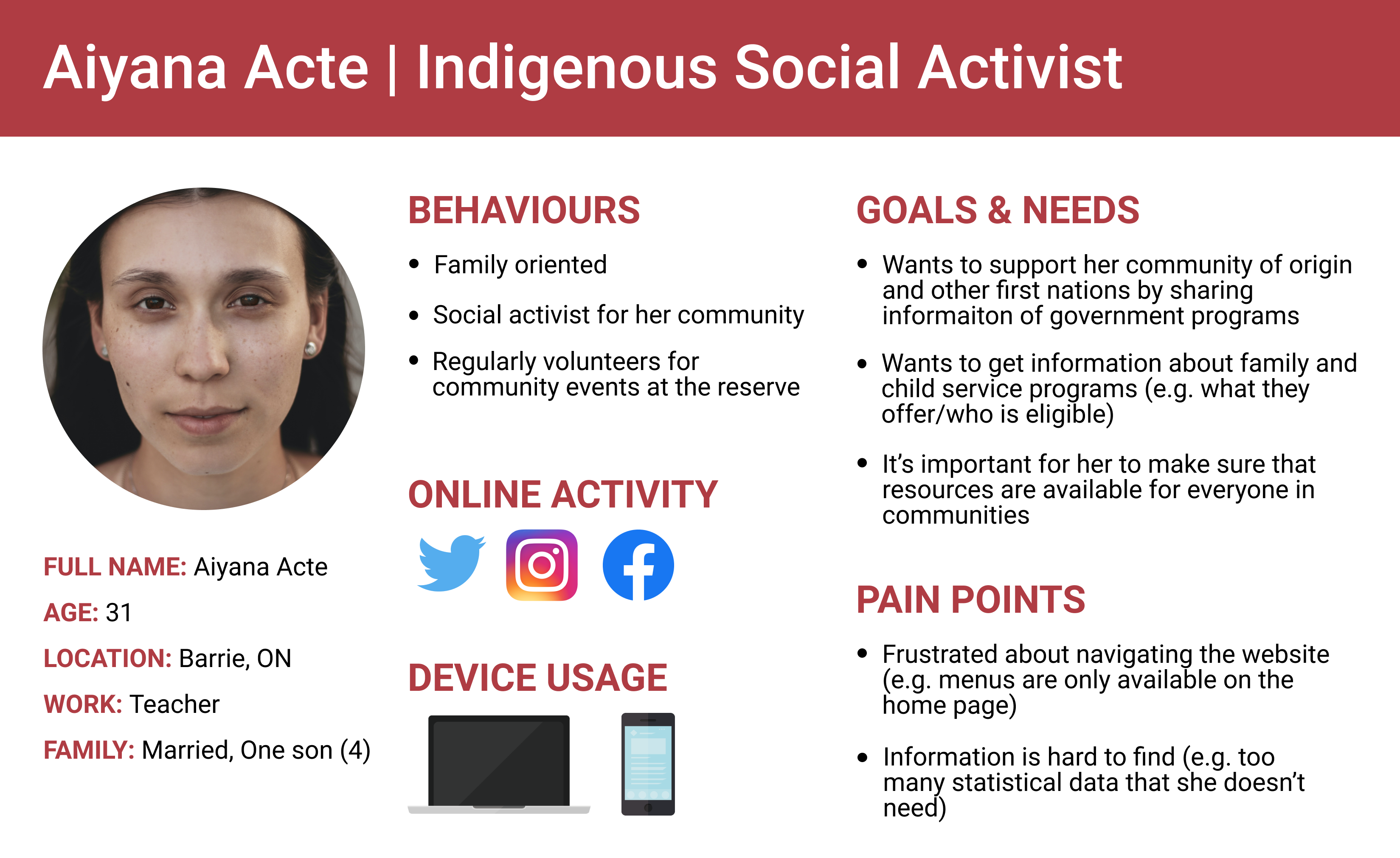
To identify our target users' goals and make assumptions about what problems they have with the website, my research partner and I created a proto-persona. We also conducted a heuristic evaluation to understand the existing website usability issues.
Proto-persona
Validating problem assumptions
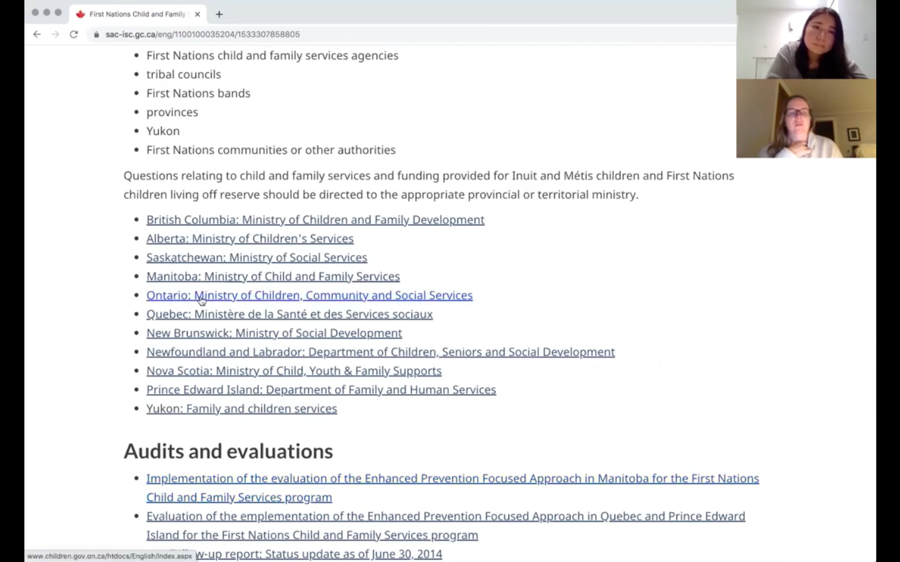
My research partner and I performed 2 rounds of user testing on the existing website and analyzed testing data in order to validate our assumptions and find new problems.
Remote user testing images
Key findings:
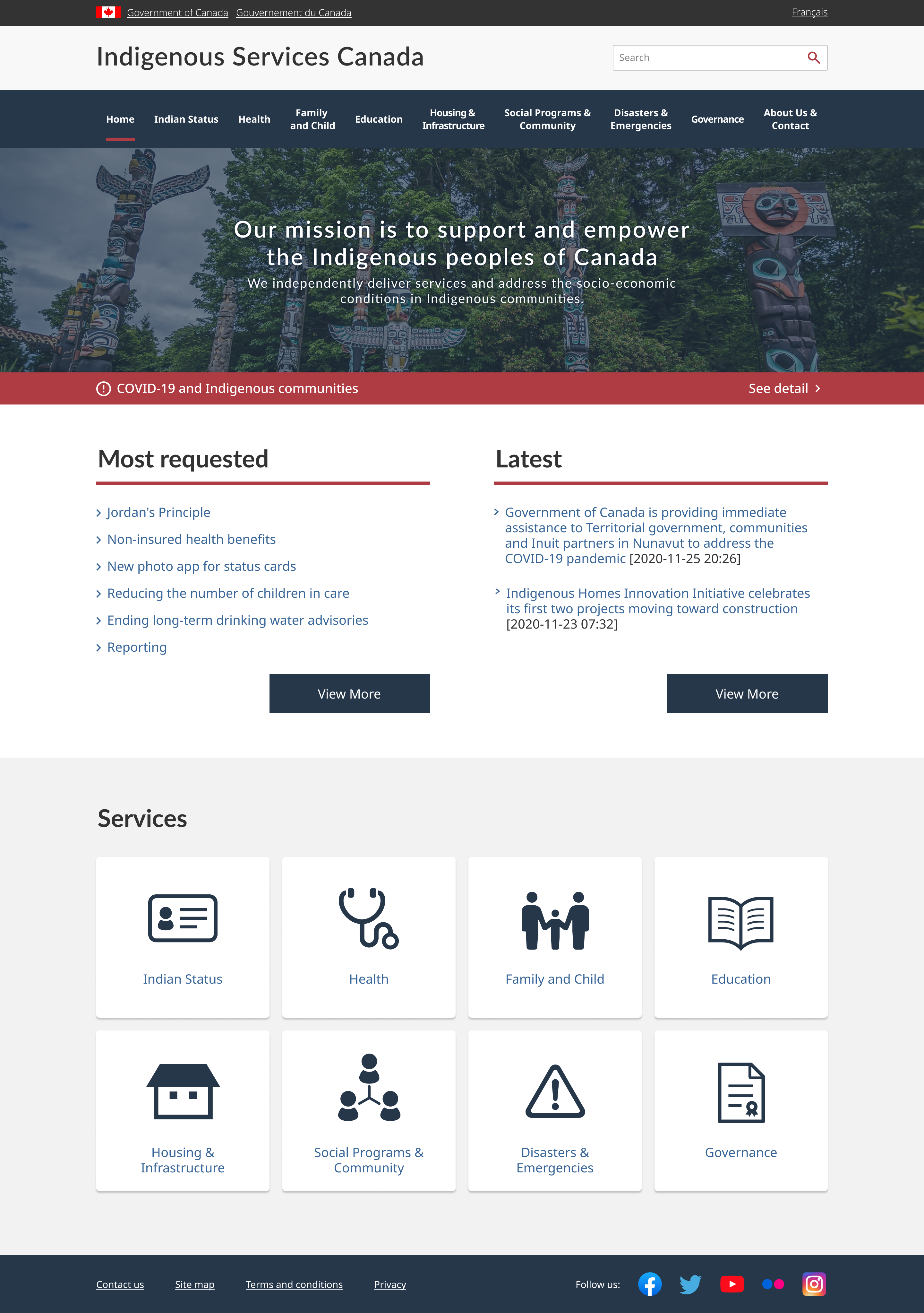
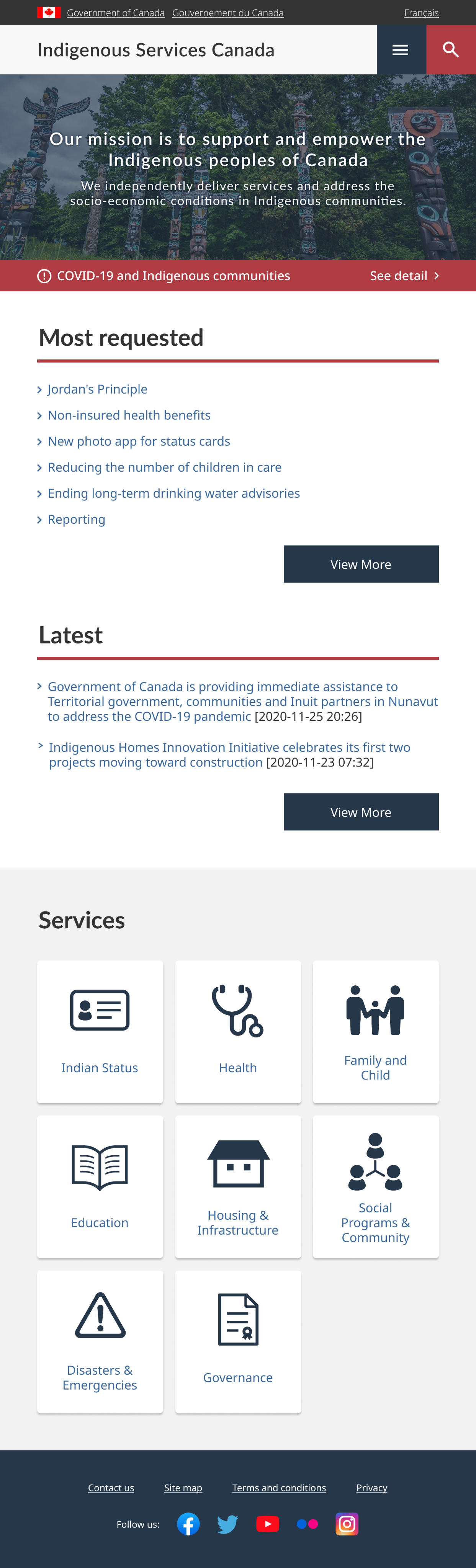
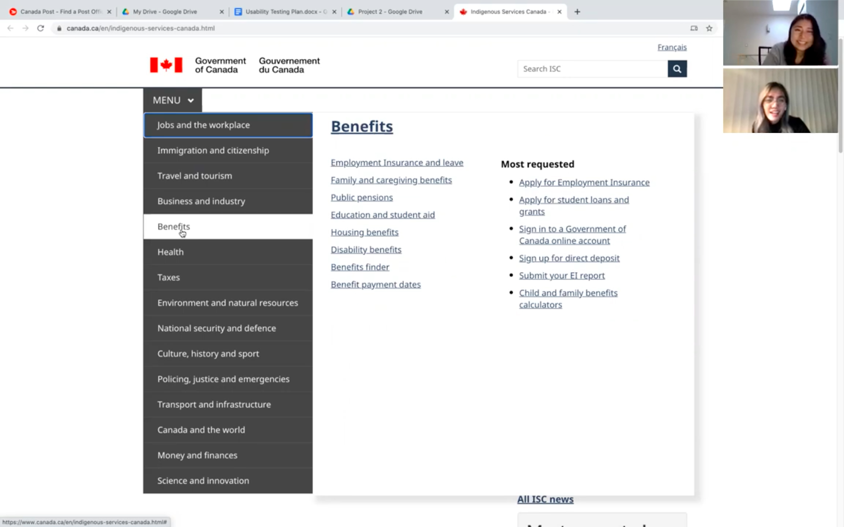
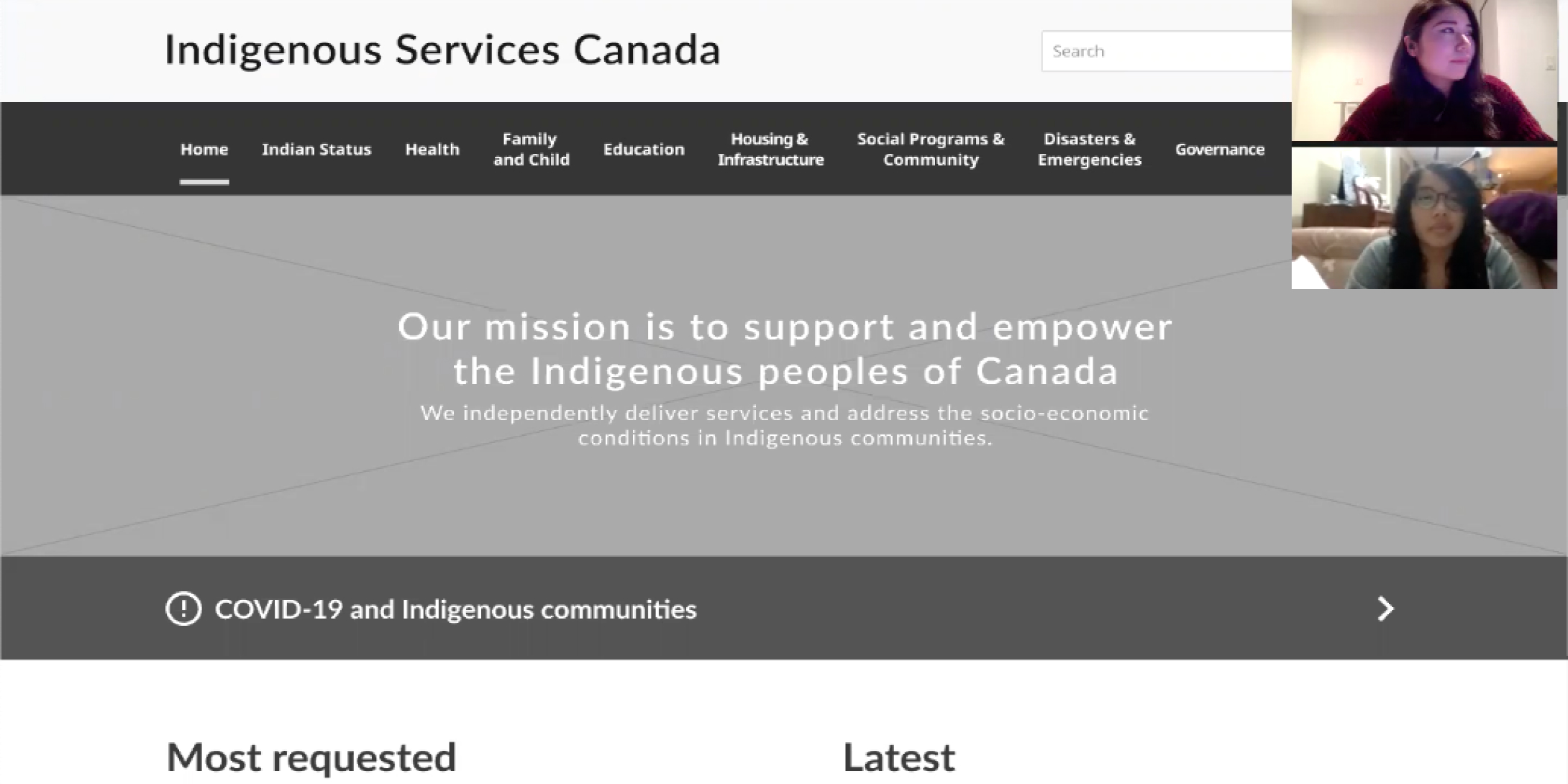
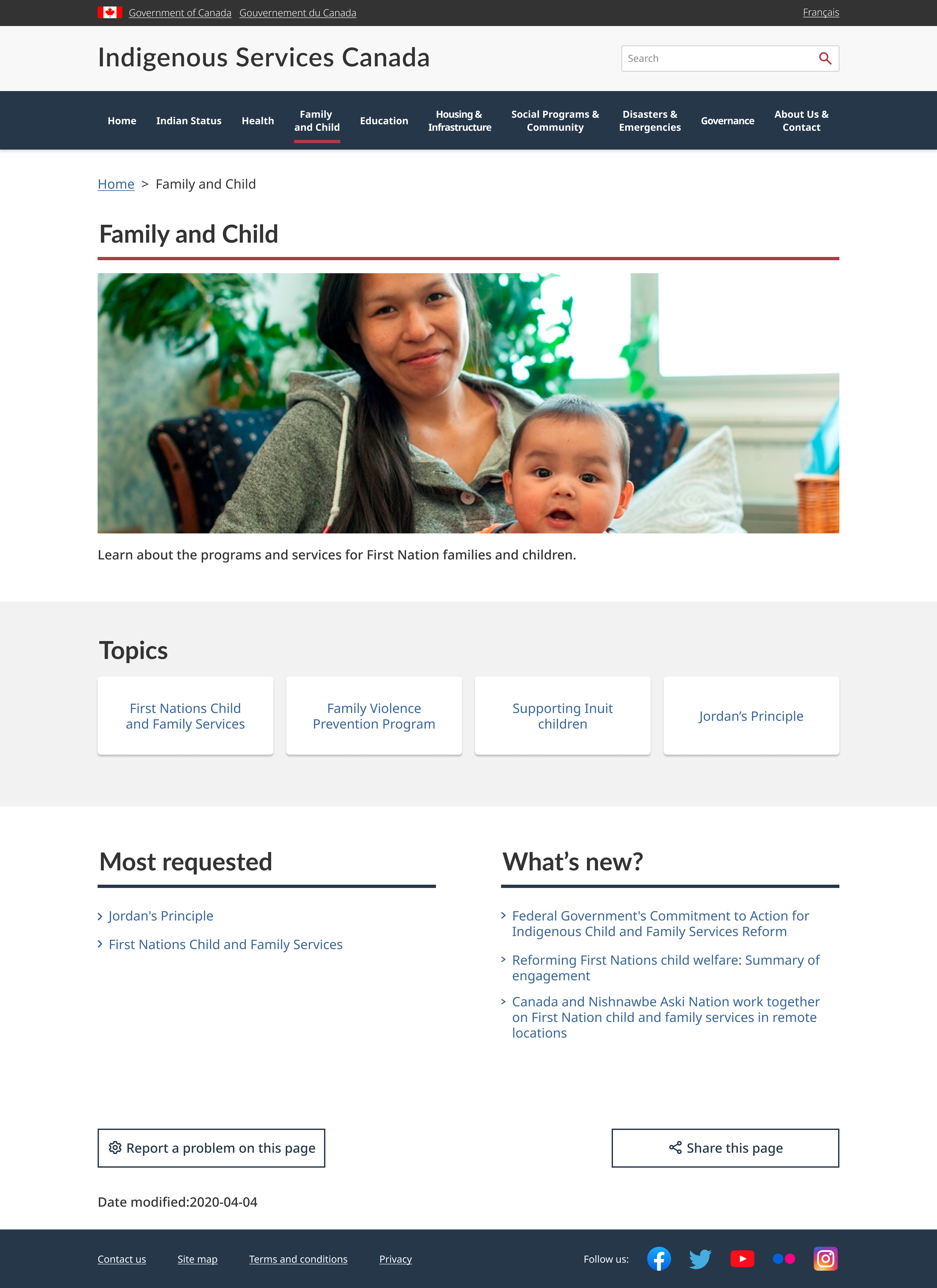
Existing website screenshot (homepage)
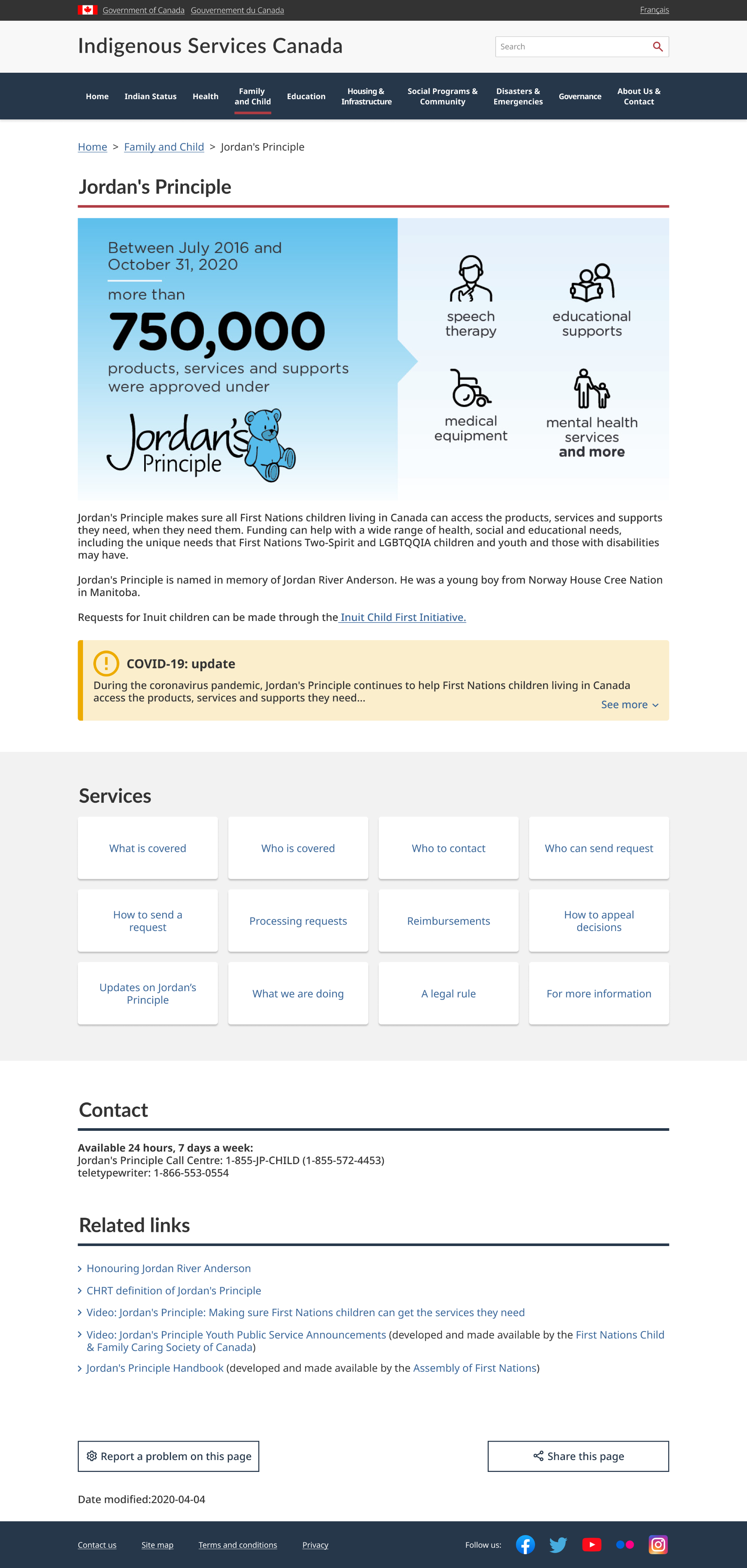
Existing website screenshot (sub-page)
What to carry over from exsisting website?
To seek further usability improvements, I conducted color accessibility tests.
The website didn't have color accessibility issues, so I have decided to carry over their existing color theme, which is easily identifiable as a government website.

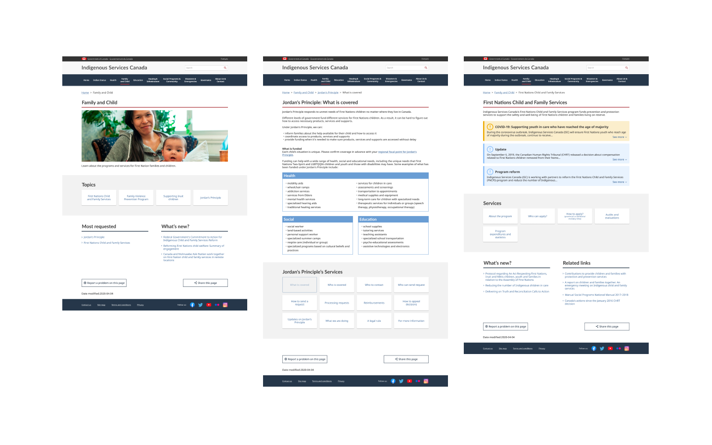
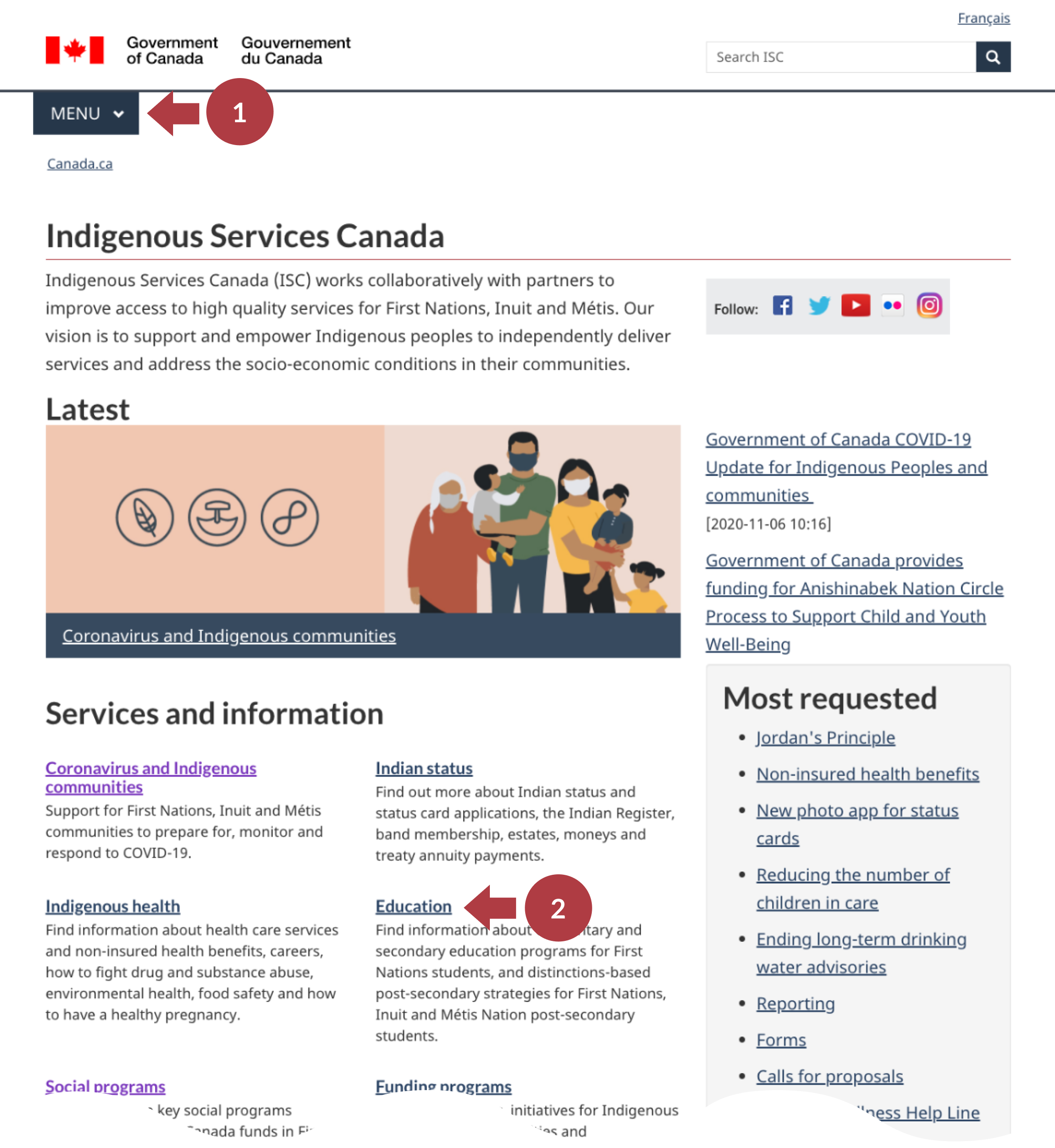
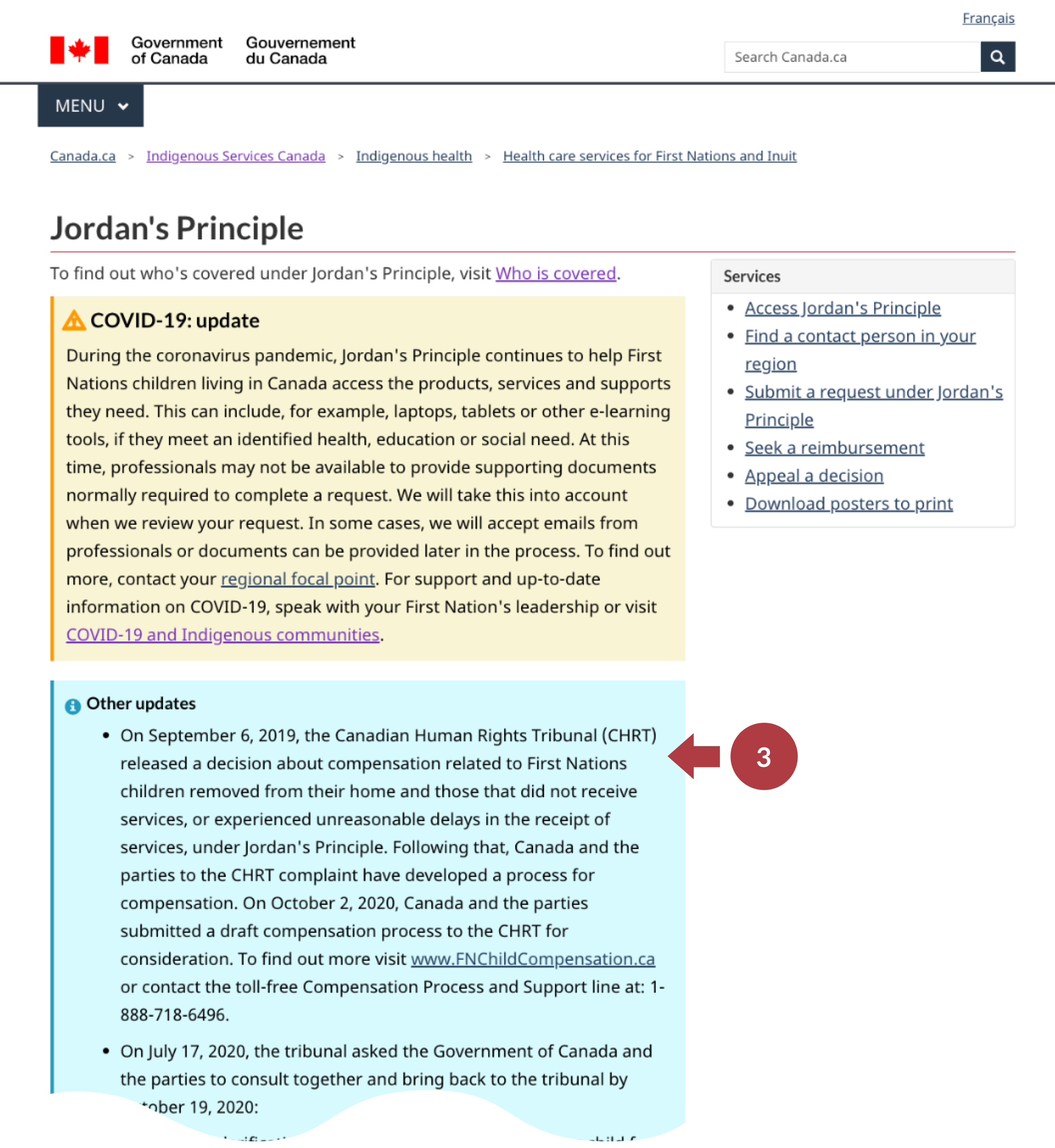
Based on the testing data and heuristic evaluation, I created redline annotations to document issues found on each page. From this step, I also found some positive points of the existing website. For example, the website does not use too many photos. This helps to load pages quickly, which is important because many indigenous people live in remote communities.
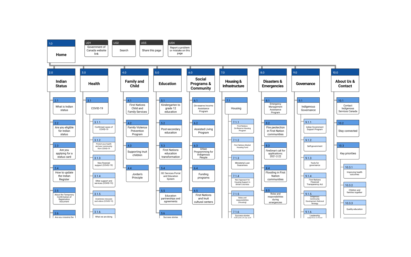
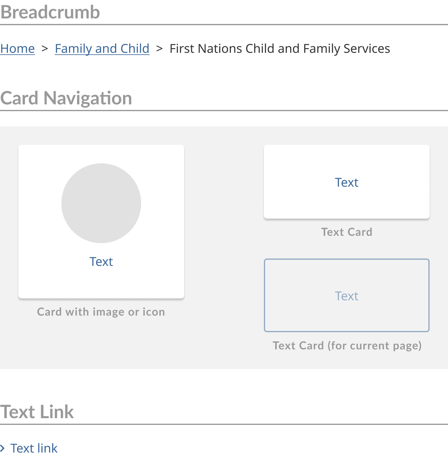
New navigation is needed
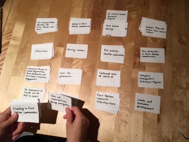
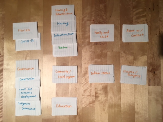
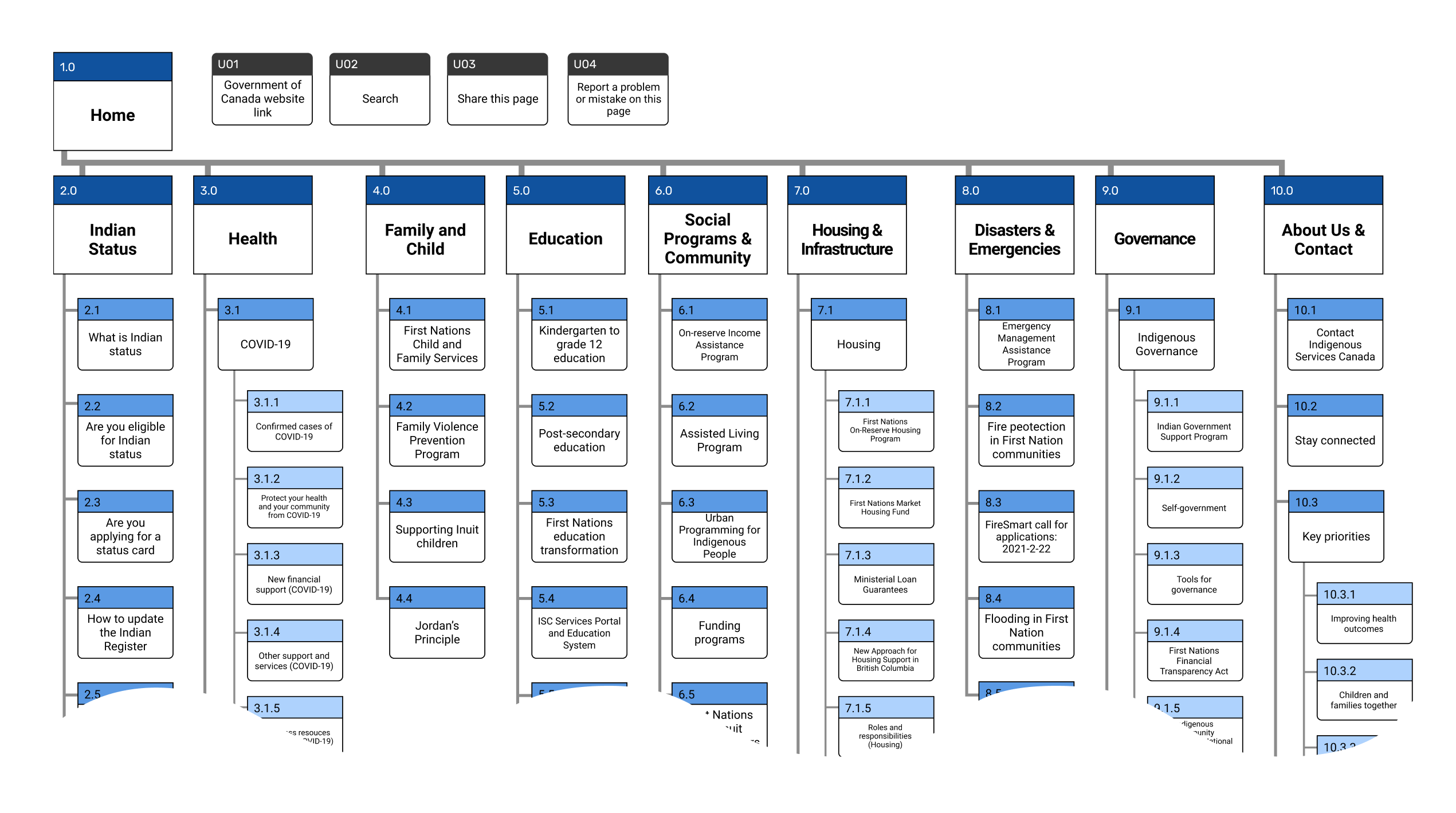
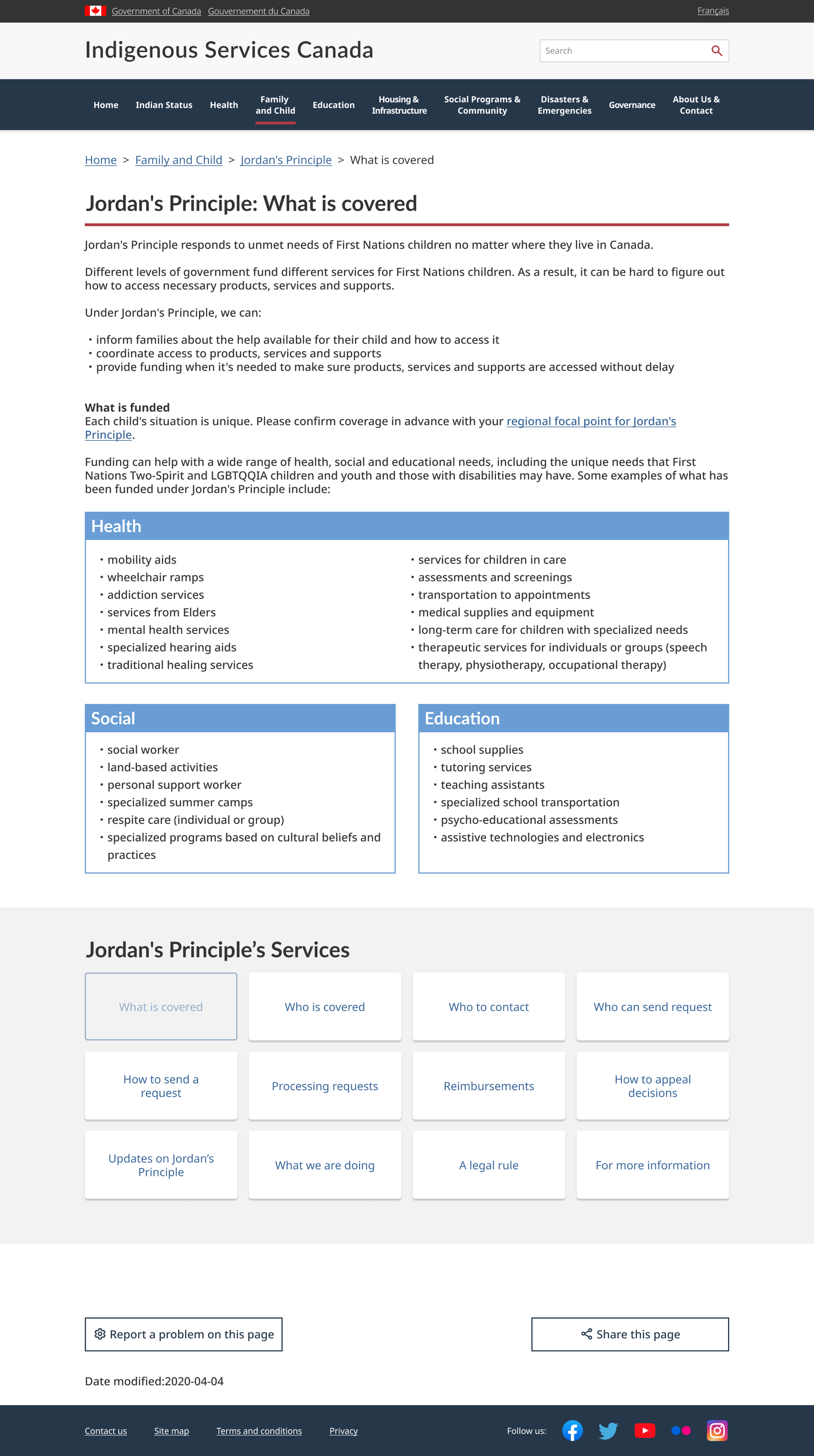
One of the main problems of the existing website was the lack of an independent navigation system. Therefore, I started creating new navigation by designing a sitemap using the card sorting result.
Card sorting
Sitemap
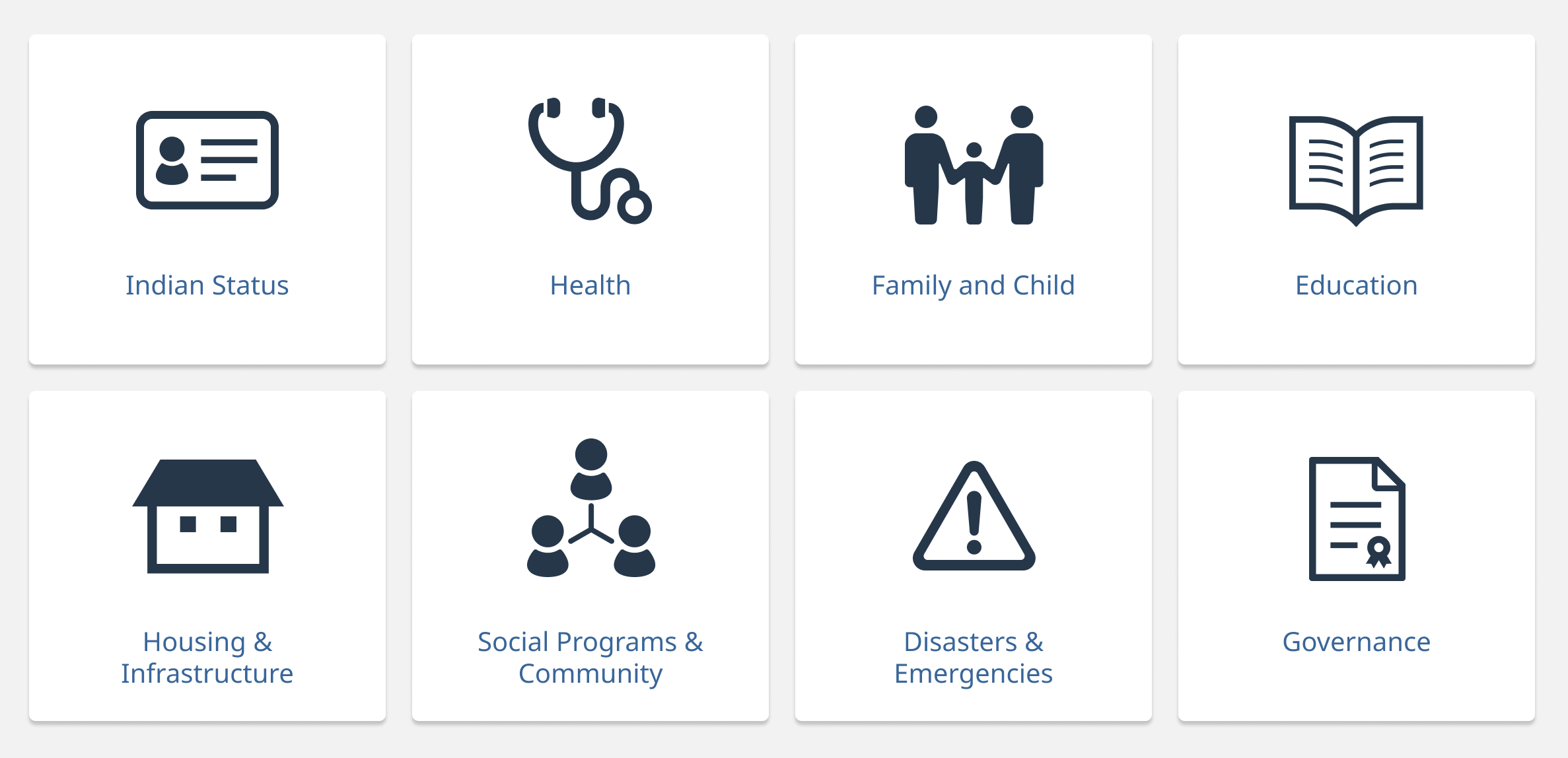
Designing a new navigation bar
I designed a new navigation bar based on the new sitemap and the LATCH principle.
Menus on the primary navigation were ordered using hierarchy; I prioritized individual needs the most, and the needs of larger groups after. Because the ISC content was biased towards individuals, I made an assumption that their primary target users are individual indigenous people.
Navigation bar
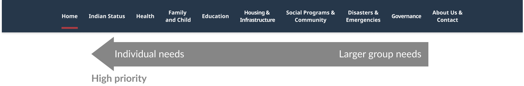
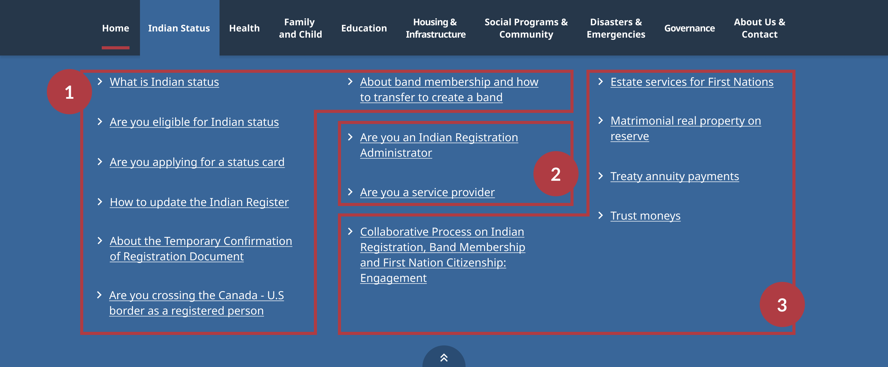
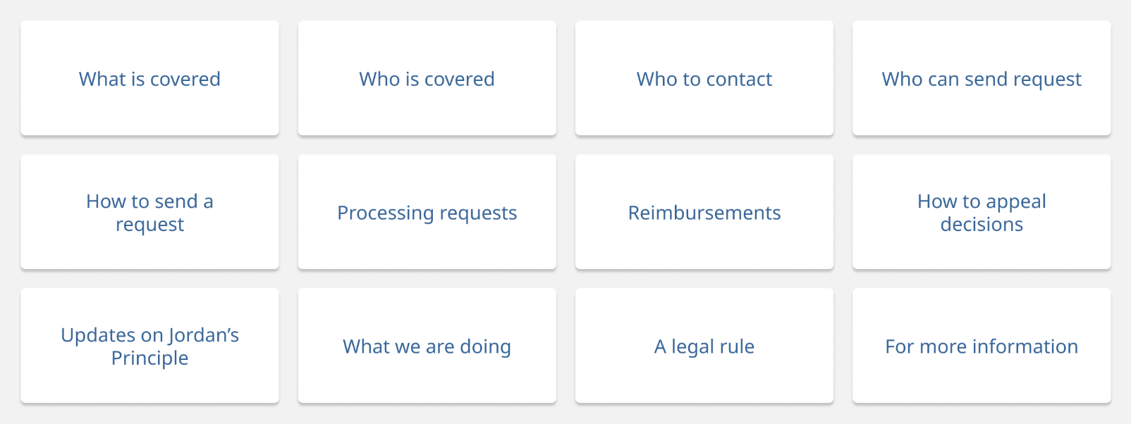
I also organized items in the secondary navigation by using categories and hierarchy.
For example, under "Indian Status", there are roughly three categories:
The target users of this website are mostly individual indigenous people. Therefore, I prioritized and placed items based on their needs.
Secondary navigation
UI Style guide
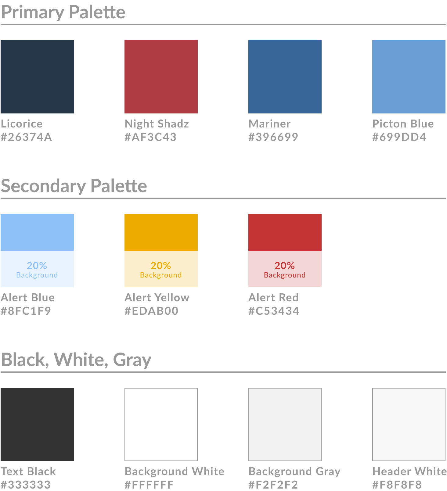
Color
The website follows primary colors from the Government of Canada website to maintain cohesiveness.
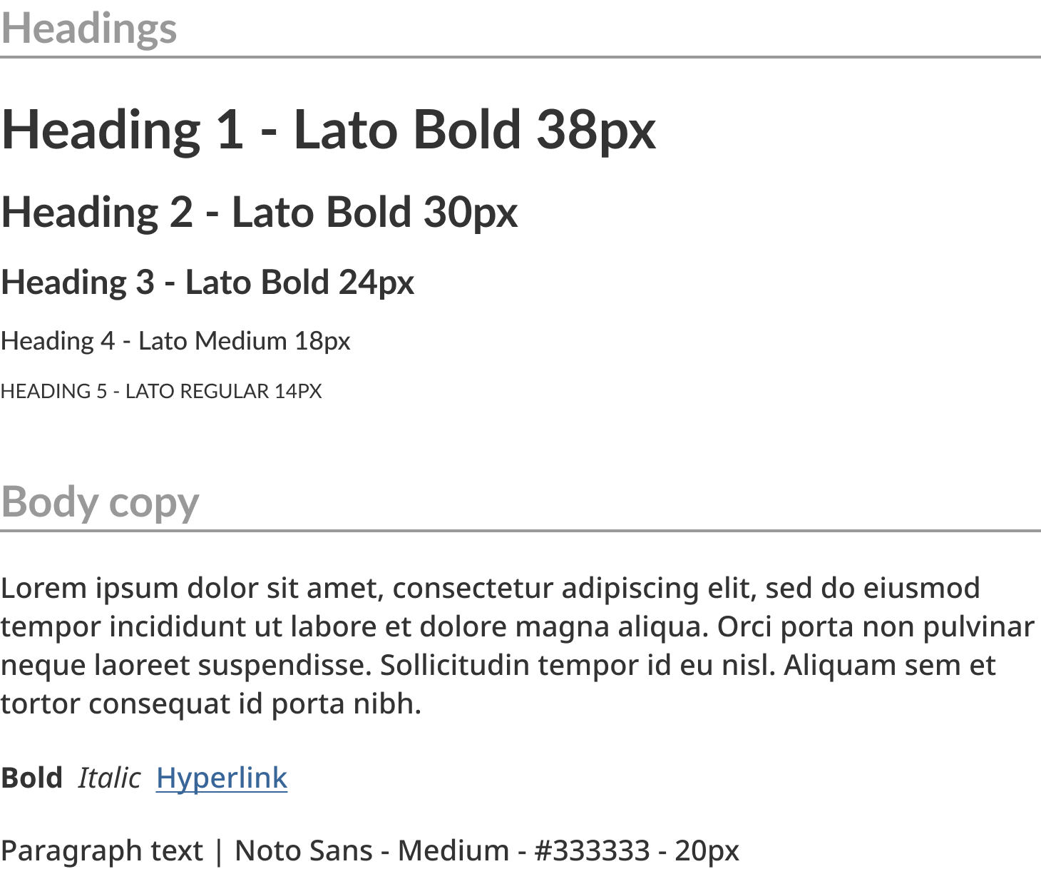
Typography
Typography is a combination of two sans-serif typefaces: Lato (headings) and Noto Sans (body copy)
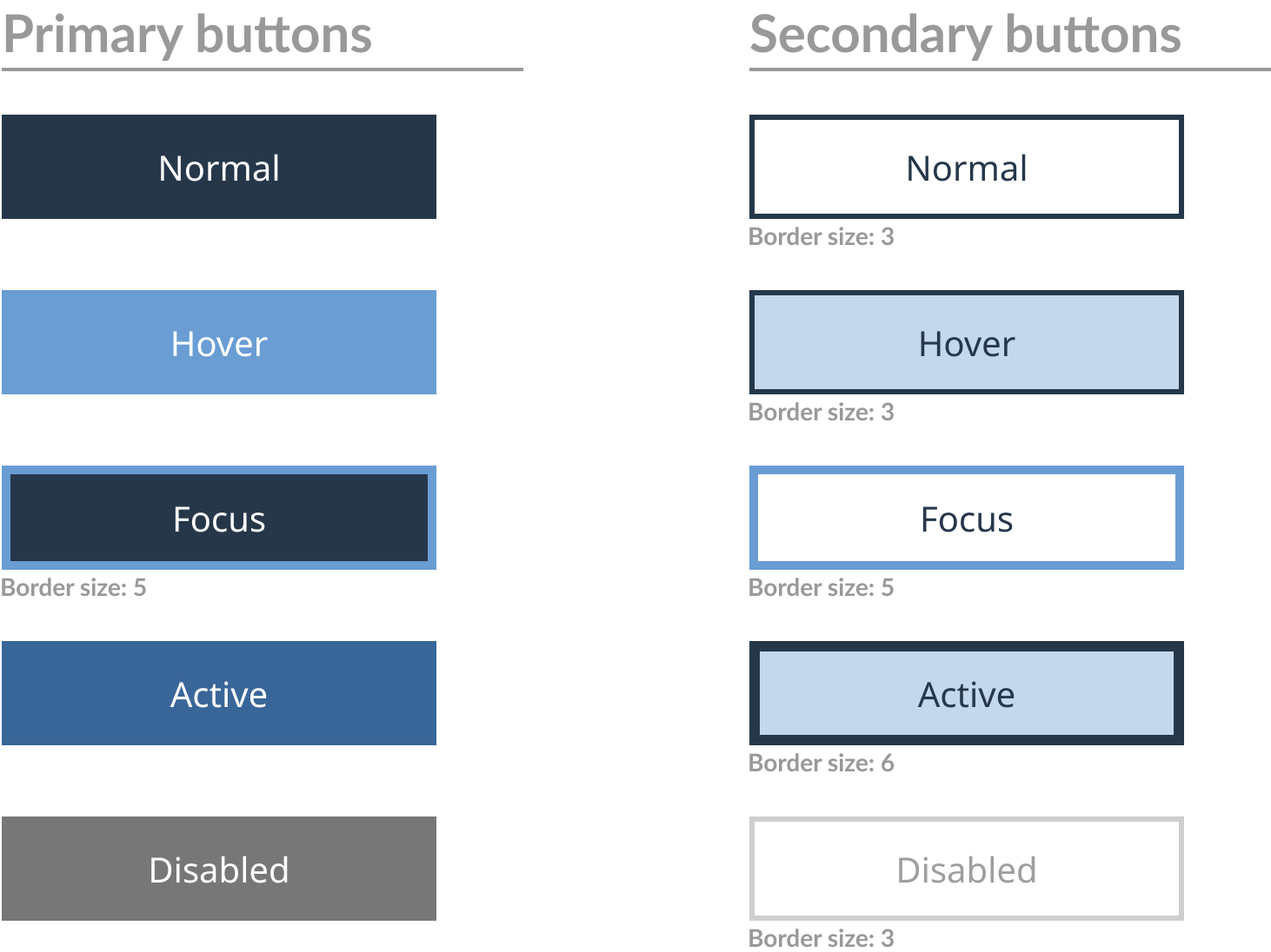
Buttons
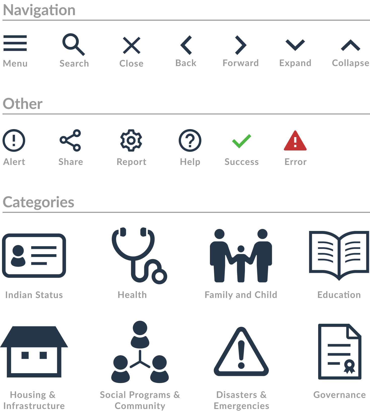
Iconography
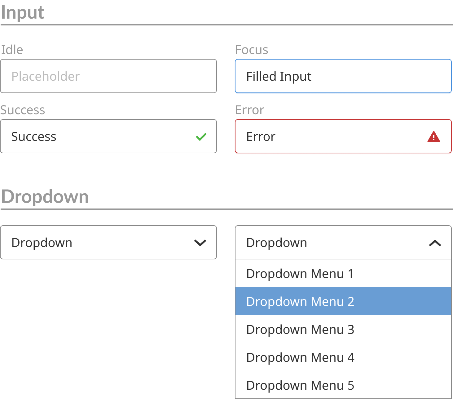
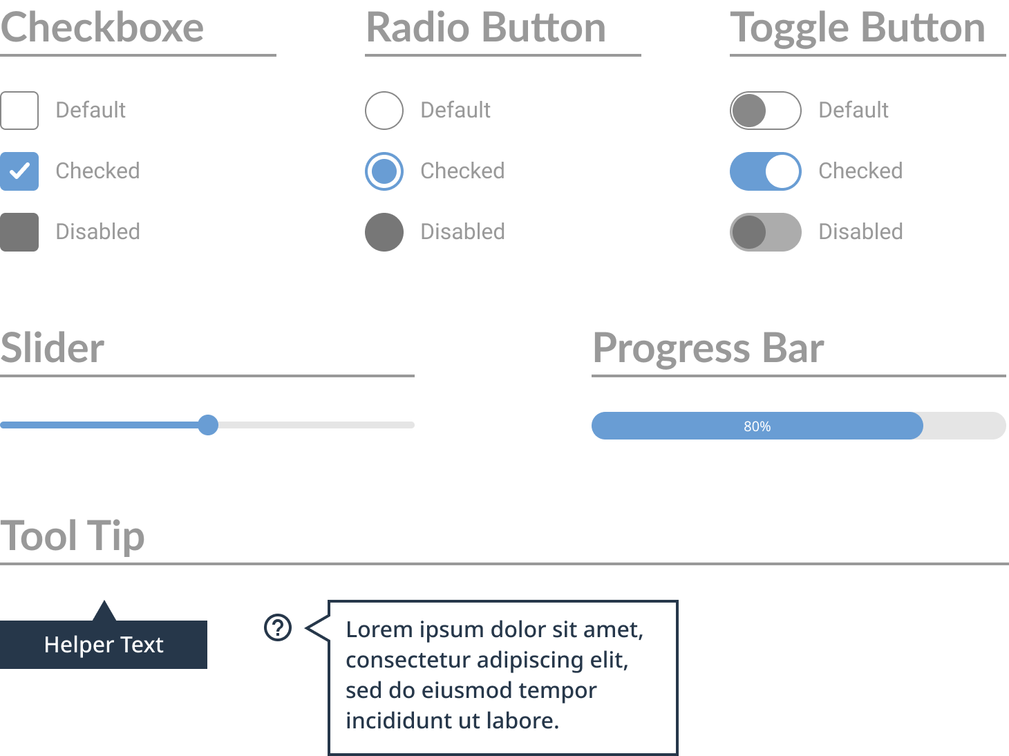
Additional UI Elements
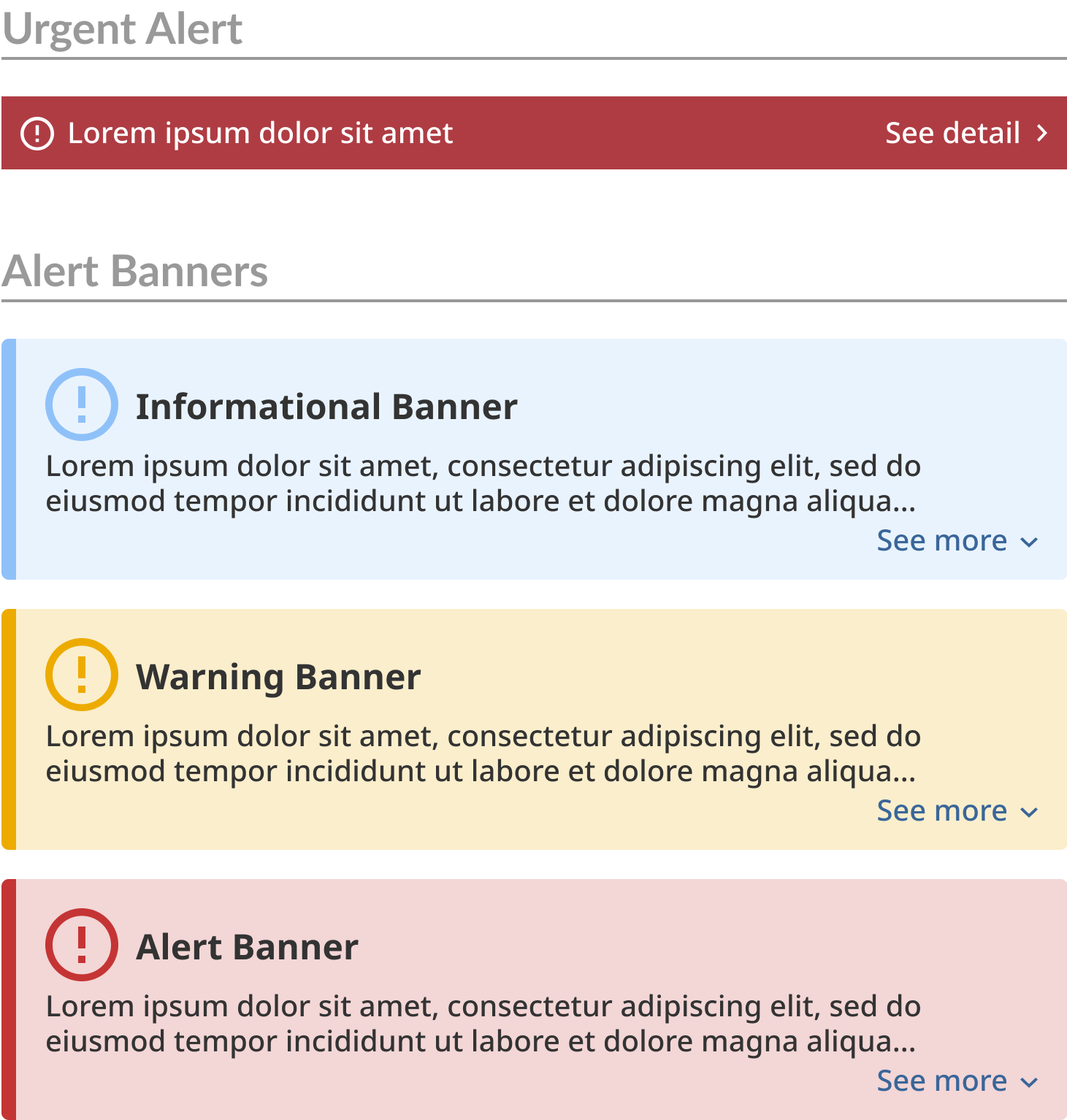
Alerts
Navigation
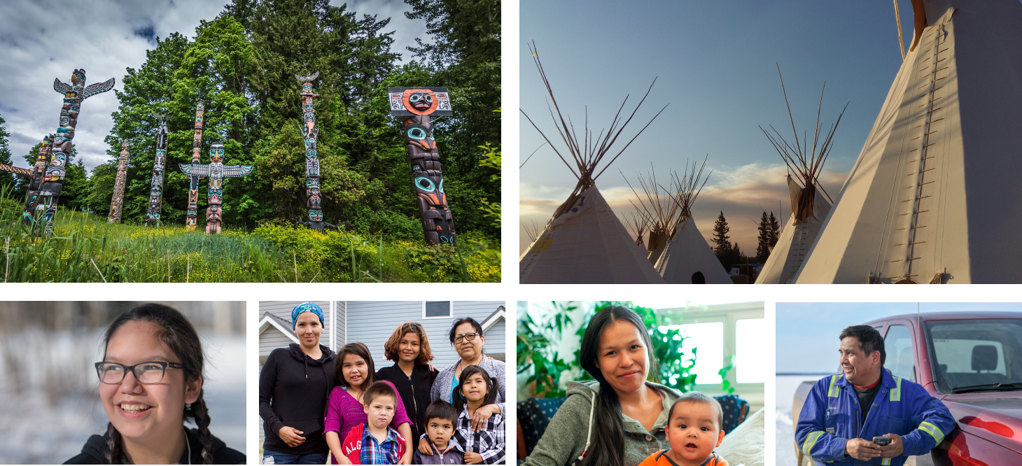
Photography
Many users from remote indigenous communities don't have a great internet connection. Therefore, the website uses a minimum number of photographs since the site should load quickly.
Use recognizable iconography to ease the burden of having to read text-heavy pages to find relevant information and navigation.
User testing & prototype iteration
I performed three different types of user testing on different phases of prototypes.
5-second user testing on a middle fidelity desktop wireframe
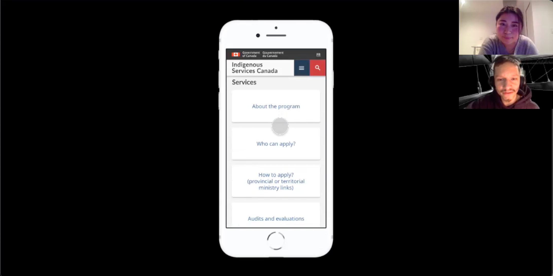
Qualitative user testing on a high-fidelity mobile prototype
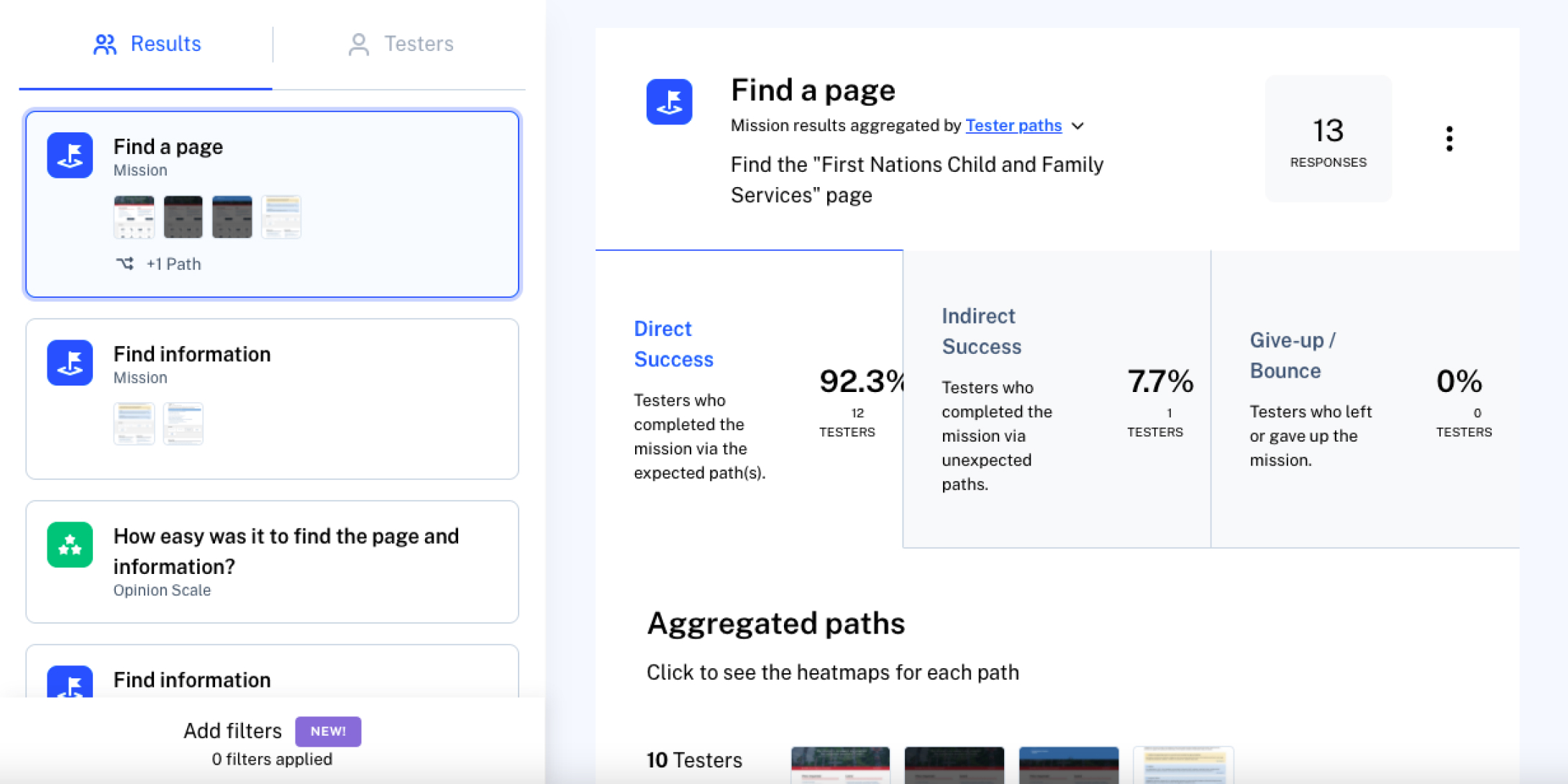
Quantitative user testing on a high-fidelity desktop prototype using Maze
Iteration 1:
Before
After
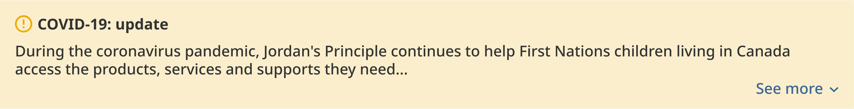
From 5-second user testing, one user thought the website was about COVID-19. Therefore, I changed the COVID-19 banner to stand out less so it doesn't distract users from understanding the site purpose.
Iteration 2:
Before

After
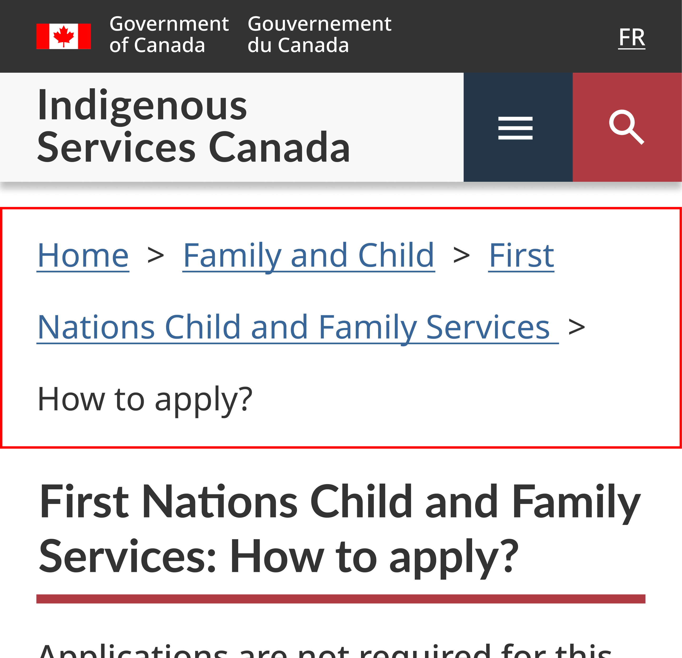
When users tried to go back to the homepage using the breadcrumbs during the mobile user testing, all users accidentally clicked the wrong link. I made the breadcrumb’s line-height toller so users can easily tap the correct link on a small mobile screen.
Iteration 3:
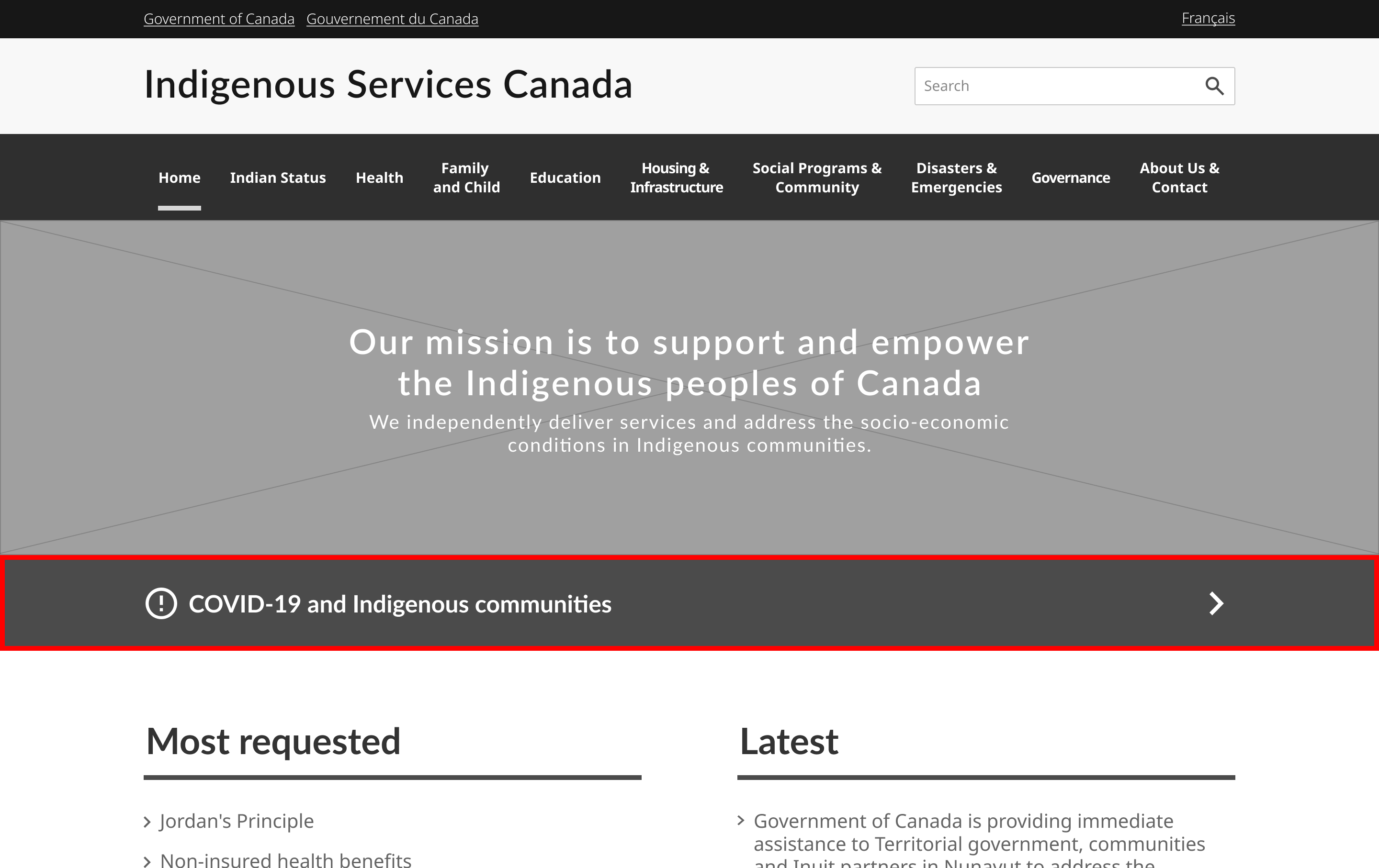
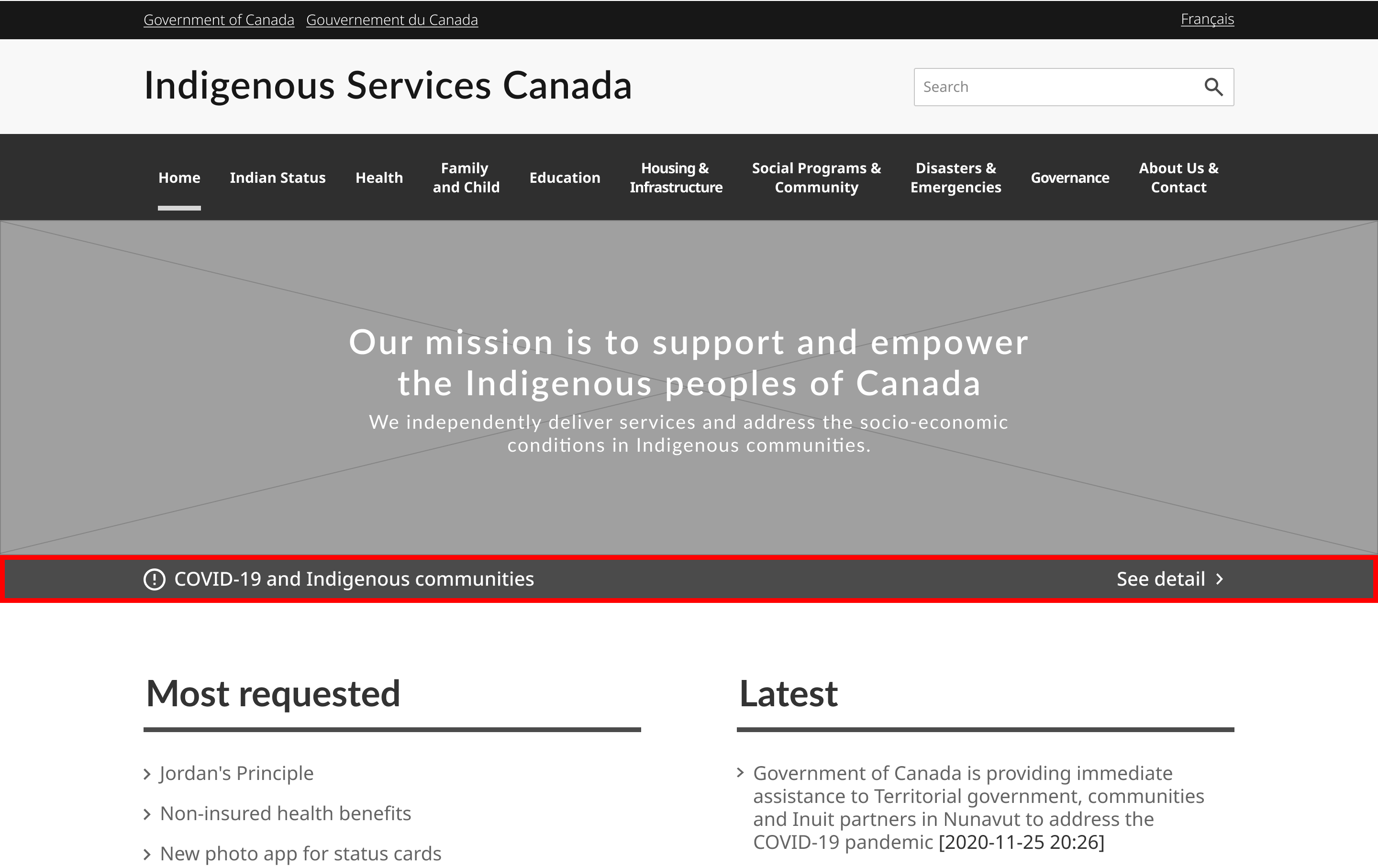
Before
After

Since other sections grabbed users’ attention more, users failed to notice the notification section during the Maze test. To solve this problem, I made the notification section design stand out more while maintaining its size.
Additional page design
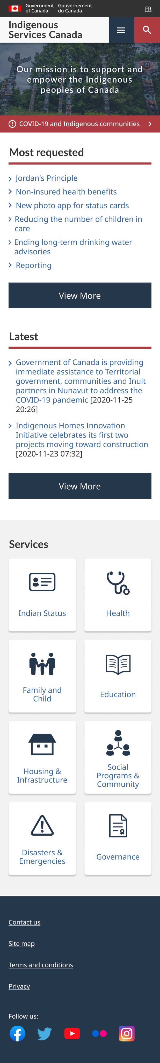
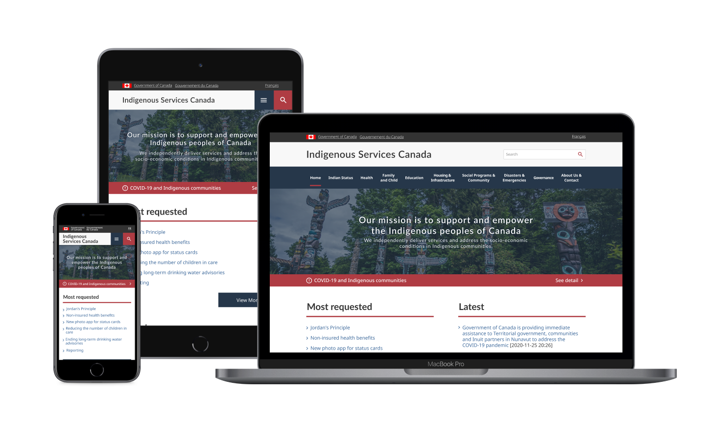
Responsive design
An interesting constraint was that many indigenous people live in remote communities that don’t have fast internet access. Therefore, I aimed to focus on making designs without using many photos.
I learned that using icons has a significant benefit for users. They trigger visual associations that users already have, so users are able to recognize information without reading text. Using a grid of distinct navigation links instead of solely inline text links was also a big part of making the text-heavy website more digestible for users.
Seeing that my assumption failed during the user test was a very beneficial experience. I learned that even though designers think their design was clear and straightforward, users sometimes take paths that designers don’t expect, and the only way to know it is to keep testing the design on real users.
Since the mobile website has more constraints than larger devices, a user-friendly design for mobile users needs to have intuitive navigation and clearly organized and prioritized content. Those principles benefit all users including desktop users.